Instagram on Monday has announced the app’s imminent design overhaul that takes aim toward bringing new energy and purpose to their colors, typeface, logo and other brand elements.

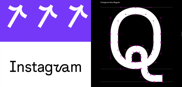
The ‘visual refresh’ as Instagram calls it, includes their custom font family Instagram Sans featuring wavy, ‘made-to-feel-human’ typefaces design that the company will use moving forward broadly in the app and marketing.
The company says Instagram Sans was inspired by the logo itself, and “reflects the shape of the glyph and our commitment to simplicity and craft.” The design combines squares and circles and as Instagram calls them ‘squircles’.

Image/ Instagram
According to the company, in its design process, their goal is to make the typeface globally accessible that they had to consult with linguists. “We partnered with language experts around the world to adapt the typeface to global scripts including Arabic, Thai and Japanese,” the company said on their blog post.
“We want to support all of our creators and community members who push culture forward to express themselves fully in any language they choose,” they added.
Most of the new fonts are straightforward sans or serif lettering highlighting the brand’s sense of inclusiveness to such a diverse global community.

Image/ Instagram
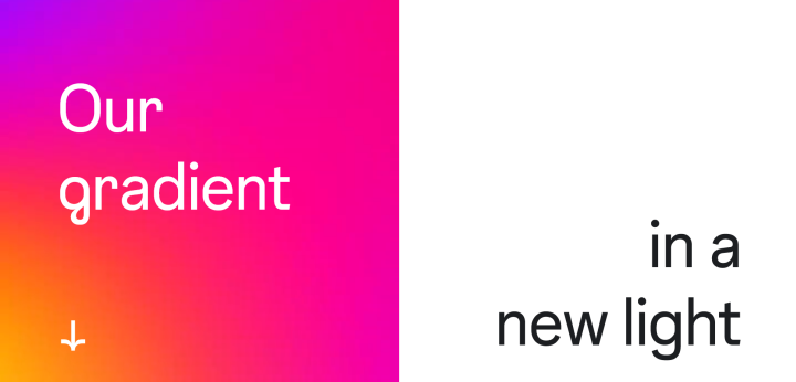
Moreover, Instagram is taking a step further on utilizing their brand colors thru ‘illuminating their gradient’. They say that it is reimagined with “using an innovative 3D modeling process to make it feel illuminated and alive.”
These gradients have been around on the app, and soon will evolve into animated gradients on a variety of UI elements such as the heart react, stories ring, texts, and stickers.

Image/ Instagram
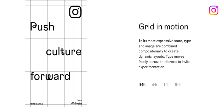
Another part their visual refresh tackles the content layout that takes focus on ‘simplicity and self-expression’ all while being ‘flexible and adaptive’.
“Our layouts mirror the app: confident and simple, placing community and content at the forefront. With an iconic core foundation, layouts signal the potential for experimentation and self-expression. Full-bleed images reference the in-app experience and give maximum attention to content,” Instagram said in a different webpage.
This update on the layout confirms that the brand will indeed go on to full-screen content, just like how TikTok does it altho the layouts will change dynamically depending on the aspect ratio of certain contents.
See Instagram’s visual refresh in full detail through these links:
Instagram Sans
Illuminated Gradient
‘Content-first’ Layouts
Source: Yugatech

No comments:
Post a Comment